



Material-led styling
Natural, Not Rustic: How to Style a Wood-and-Fabric Wall Lamp for a Polished Home
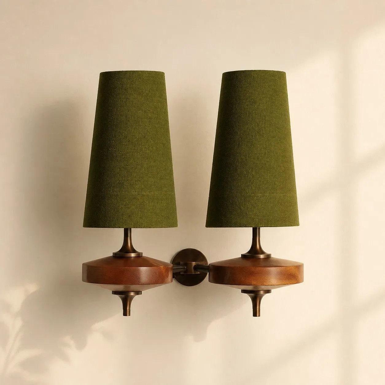
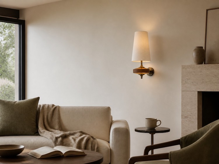
A wooden fabric wall lamp looks most current when it connects the room's existing materials rather than announcing a nature theme. Choose one anchor wood tone, let the shade control contrast, add one complementary material, and repeat a key color once elsewhere. The result feels warm and collected without becoming busy or rustic.
What "Natural and Fashionable" Actually Means
Natural style begins with recognizable material character: grain, woven texture, tonal variation and surfaces that do not look overly artificial. Fashionable style is less about chasing a color of the month and more about editing. It uses a clear silhouette, deliberate contrast and enough empty space for each material to register.
Terrapin Bright Green's 14 Patterns of Biophilic Design describes a good material connection with nature as rich, warm and authentic, with natural wood grain among its examples. That idea is useful here, but it does not mean every object must be wood, rattan or greenery. One genuine material signal can be stronger than a room full of nature-themed accessories.
Start With One Anchor Wood Tone
Begin with the largest wood element already in view: flooring, a bed frame, a console, cabinetry or a door. The sconce does not need to match it exactly. Architectural Digest's designer guidance on mixing woods recommends treating wood tones as neutrals, using clear light-dark contrast when necessary, and introducing glass, metal, stone, a rug or white elements to keep the mix coherent.
Look at undertone before darkness. A warm brown floor and a medium walnut-colored lamp can relate even when their values differ. A pale gray-washed cabinet beside a strongly red wood may need a neutral wall or textile between them. Repeat the lamp's wood tone once in a modest object such as a frame or tray; repeating it on every piece can make the room feel like a furniture set.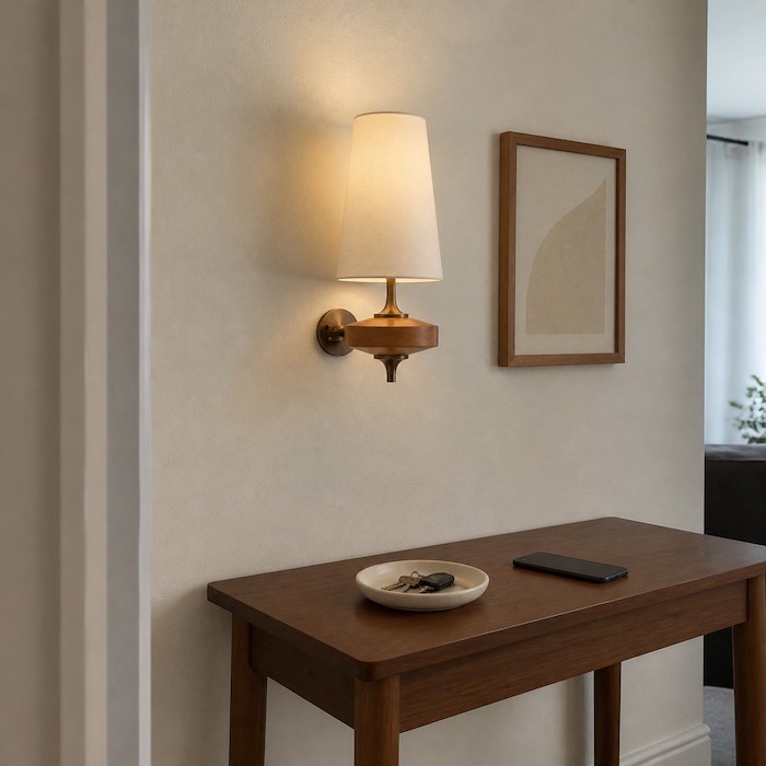
If you need to verify what a product page can and cannot tell you about grain, shade and light behavior, keep that technical decision with In-Depth Review: The Ultimate Guide to Modern Wood Fabric Sconces—Wood Grain, Fabric, and Light Effect Analysis. Styling should follow verified product information, not a guessed wood species from a photograph.
Let the Fabric Shade Control the Contrast
The shade is the fastest way to decide whether a wooden fabric wall lamp blends into the wall or acts as an accent. White keeps the outline crisp and works well when the room already contains several colors. Green or sage green can bridge wood with plants or muted upholstery. Dusty blue introduces a cooler counterpoint. Mustard yellow or red should be treated as a visible accent rather than another neutral.
Use the wall as the test. On a pale wall, a white shade makes the wood and metal more noticeable; a colored shade makes the whole fixture a focal point. On a deeper wall color, white creates a graphic contrast, while a related mid-tone shade produces a quieter, layered effect. Repeat a colored shade once in artwork, a cushion or a small object, then stop. Several unrelated accents will compete with the lamp.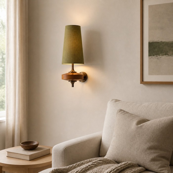
Compare Hour Rho shade colors and configurations
Three Material Pairings That Keep Wood Current
Wood and fabric already provide grain and softness. The third material should create contrast, not more of the same texture. A current Architectural Digest example pairs richer woods with softer textiles, plaster and honed stone, while emphasizing restraint and authenticity rather than surface-level decoration.
1. Wood + fabric + a matte mineral surface
Use plaster-look walls, honed stone, ceramic or a quiet limewash effect. This combination suits bedrooms and calm living rooms because the surfaces differ without adding shine. Avoid stacking several rough finishes; one textured wall or one stone element is enough.
2. Wood + fabric + glass or metal
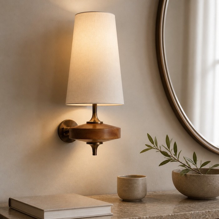
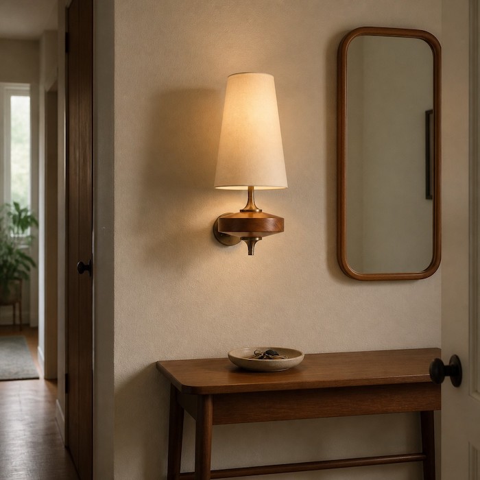
A mirror, slim metal console or glass-topped table sharpens the softness of wood and cloth. This is useful in hallways and contemporary rooms. Keep reflective surfaces limited so the lamp remains the warm connector rather than one of many shiny objects.
3. Wood + fabric + one supporting textile
Choose a rug, upholstered headboard or curtain with a different weave but a related color. This makes a bedroom or reading corner feel layered. Do not repeat the same coarse texture everywhere; variation looks collected, while duplication can feel themed.
Room Recipes: Hallway, Bedside and Living Room
| Space | Build the look | Keep under control |
|---|---|---|
| Hallway | One sconce, a narrow console and a simple mirror; use white or muted color against a calm wall. | Leave clear wall around the fixture instead of adding a dense gallery. |
| Bedside | Use a balanced pair when the bed is the main composition; echo the shade color in the headboard or bedding. | Do not assume visual symmetry proves adequate reading light; function needs a separate check. |
| Living room | Place one fixture near a console, artwork or seating group and repeat its wood tone in one small object. | Avoid making every table, frame and cabinet the same brown. |
Keep It Edited, Not Themed
The quickest route from natural to rustic pastiche is accumulation: matching wood sets, several baskets, many plants, rough ceramics and botanical prints all competing in one view. Remove in the opposite order. First reduce repeated motifs, then unrelated accent colors, then duplicate textures. Keep the items with the clearest shape or strongest personal value.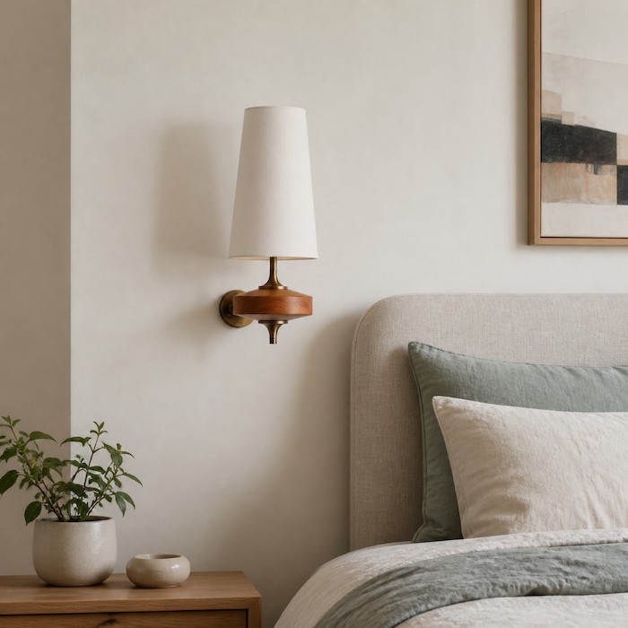
Fashionable does not require adding every current idea either. If you want the evidence and room-matching logic behind annual directions, keep that discussion with Break the chill: 5 key trends for 2026 with wood wall sconces. In this room, select one statement only: the shade color, the silhouette or the material contrast. Let the other elements support it quietly.
Choose the Silhouette, Then Respect the Wiring
A one-head form works as a compact punctuation mark on a narrow return wall, beside a mirror or as part of an asymmetrical composition. A two-head form occupies more visual width and can balance a broader console or central wall area. Choose between them by the wall's proportions and the surrounding furniture, not by assuming a specific brightness that has not been verified.
Hour Rho is presented as a hardwired wall lamp, so confirm the wall box, supply and local installation requirements before ordering; use a qualified electrician where required. Renters or anyone unable to alter wiring should keep that separate decision with Quiet Luxury Without the Mortgage: How the 2026 Rental Generation Uses Wireless Wood Sconces for Damage-Free Upgrades. A wireless article must not be read as a feature claim for this product.
Where Hour Rho Fits the Formula
The Hour Rho product page combines a wood and metal body with a fabric shade, offers one- and two-head configurations, and shows several shade colors. Those options support the styling method above: wood supplies the anchor, fabric softens the material mix, metal adds definition, and the shade determines whether the fixture blends or stands out. Select from the facts shown on the current product page and confirm any installation detail that affects your home.
FAQ: Styling a Wooden Fabric Wall Lamp
Do all wood tones in a room need to match?
No. Relate their undertones, use deliberate contrast, and repeat one tone once for cohesion.
Which shade color is easiest to style?
White is the simplest bridge. Muted green or blue works when that color already appears elsewhere.
Can a colored shade work on a dark wall?
Yes. Choose either a clear light-dark contrast or a related mid-tone for a quieter effect.
Should I choose one head or two?
Choose by visual width and wall composition, then verify lighting needs separately.
How do I stop the room from looking rustic?
Limit repeated natural motifs and pair wood with one cleaner material such as glass, metal or honed stone.